The evolution of NHL jerseys mirrors the story of hockey itself. From scratchy wool pullovers to lightweight performance fabrics, every stitch marks a new era of the game.
What started as gear built for warmth on frozen ponds has evolved into precision-made uniforms designed for speed, sweat control, and style.
Each generation of players wore jerseys that matched the way hockey looked and felt at the time. In the early days, thick knit sweaters soaked up ice and sweat, making every shift a grind.
Today’s pros skate in gear engineered to move with them, aerodynamic, dry, and built for the pace of the modern game.
But through every change in fabric or fit, one thing’s stayed the same. The jersey means pride. Pulling it on isn’t just part of suiting up, it’s a statement. It’s color, heritage, and history stitched together.
Whether it’s wool or synthetic, lace-up or zippered, nothing matches that feeling when you see your team’s logo across your chest.
A Symbol That Never Gets Old
For players and fans, the jersey has always meant more than fabric. It’s pride stitched into color. It’s history you can wear.
From frozen ponds to packed arenas, the look of a team connects generations in a way few other sports can.
The technology keeps changing, but the feeling doesn’t. Pulling on that sweater still hits the same, it’s about identity, rivalry, and belonging. And that’s something no fabric upgrade will ever replace.
The Wool Era (1900s–1940s): Tradition Born in Simplicity
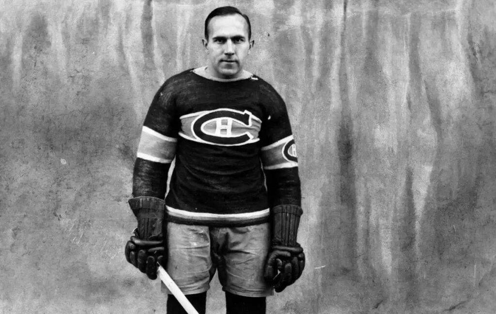
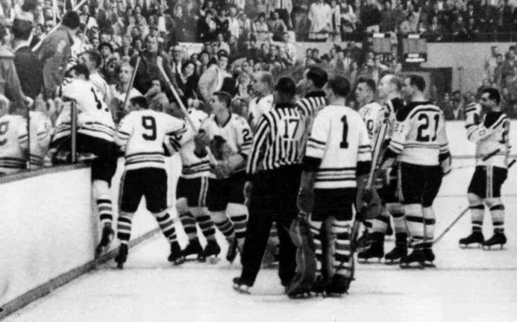
In hockey’s earliest years, jerseys were exactly what the name suggests, sweaters. Players wore heavy, hand-knit wool pullovers made for warmth, not speed.
They were simple, often just stripes or solid colors that helped teams stand out on outdoor rinks.
Logos were stitched by hand, and numbers were felt patches, usually white on dark backgrounds so fans could tell players apart. There were no nameplates or sponsors, just cold air and raw effort.
The same thick wool that kept players warm also soaked up sweat and ice, turning heavy by the end of a period.
Still, this era built the foundation of hockey’s visual identity. The Montreal Canadiens’ red sweater with its blue stripe and white “C” logo became an icon that still defines the sport.
Other early teams used bold colors that popped even in black-and-white photos, setting the tone for decades of design.
It was a rough start, but it fit the game. The wool jerseys of the 1900s captured hockey at its roots, gritty, cold, and pure.
The Television Age (1950s–1960s): Color Meets the Camera
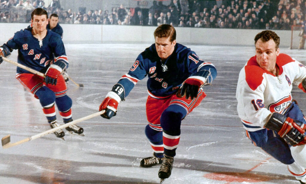
When hockey hit TV screens, everything about the game started to look different. Teams ditched wool for lighter cotton and early synthetics that let players move freely and stay drier under the lights. By the 1960s, wool was history.
The new fabrics were faster, cleaner, and built for the pace of a modern, indoor game.
Color television changed the rules again. For the first time, fans could see every shade on the screen, so teams leaned into brighter colors and bolder logos.
Expansion clubs like the Los Angeles Kings and California Seals went all-in with purple, gold, and green, a far cry from the muted tones of the Original Six. Design and performance finally stood on equal ground.
The NHL also began standardizing jerseys for clarity. Player numbers had to be easy to read so fans, refs, and broadcasters could follow the action.
That small move set the stage for the next wave of NHL uniform evolution, where branding and visibility became just as important as function.
By the late 1960s, hockey sweaters were no longer just equipment. They were part of the show. The sport had entered its broadcast era, and the jersey had become a star in its own right.
The Expansion Era (1970s–1980s): Experimentation and Identity
The 1970s and 1980s marked a turning point for NHL jersey design. Expansion teams brought new colors, new markets, and a wave of creativity that gave the league a bolder personality.
Hockey was no longer just about performance; it was about presentation.
In 1970, the NHL flipped its long-standing color rule, making home teams wear white and visitors wear dark. The change, influenced by Hockey Night in Canada, gave home fans something new each night as visiting teams brought their full-color uniforms to town.
It was a small adjustment that completely reshaped how the game looked on TV and in the stands.
By 1977, the league made player names mandatory on the back of jerseys. Toronto’s Harold Ballard tried to fight it, even matching the lettering color to the background so names were nearly invisible.
The NHL quickly stepped in, requiring contrasting colors for legibility. Fans embraced it immediately, since they could finally spot their favorite players anywhere on the ice.
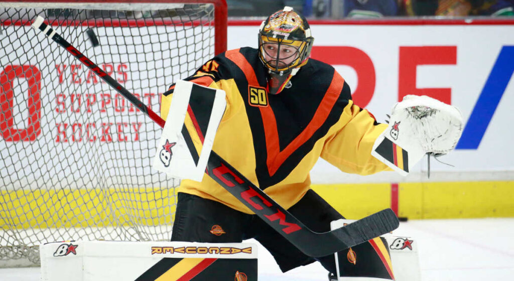
This era also produced some of the most memorable jerseys in hockey history. The Vancouver Canucks’ “Flying V” debuted in 1978 and instantly divided opinion.
With its bright orange and yellow chevrons stretching from shoulders to waist, it looked nothing like anything else in sports.
The California Golden Seals and Los Angeles Kings also pushed boundaries with bold greens, golds, and yellows, and the Seals’ white skates became an infamous fashion statement of their own.
Not every design hit the mark, but each one helped the NHL grow its identity beyond the Original Six tradition.
Technology helped fuel that creativity. Polyester began to replace heavier materials, making jerseys lighter and less prone to soaking up water. Tackle twill lettering became common, giving logos and numbers a sharper look.
Full sublimation printing was still years away from widespread use, but the groundwork for the next wave of design innovation was already in motion.
The mid-1980s also saw a growing emphasis on player safety and uniform functionality. Many teams started using fight straps, small internal ties that connected jerseys to pants to prevent them from being pulled off during altercations.
While not yet a league-wide rule, it quickly became standard practice across the NHL.
The expansion era was bold, unpredictable, and full of personality. Teams were willing to experiment, and in doing so, they gave hockey one of its most colorful and defining periods. It was a time when jerseys became part of the sport’s story, not just part of the equipment.
From new materials to league-wide standards, the table below highlights how the 1970s and 1980s reshaped the modern hockey uniform.
| Year | Development | Impact |
| 1970 | Home teams wear white | Gave fans more color variety from visiting teams |
| 1977 | Player nameplates required | Helped fans and broadcasters easily identify players |
| Early 1980s | Polyester replaces cotton | Jerseys became lighter, cooler, and more durable |
| Mid 1980s | Fight strap introduced | Increased safety and prevented jersey removal during fights |
| 1978 to 1985 | Vancouver Canucks Flying V | Iconic symbol of hockey design experimentation |
The Creative Boom (1990s): When Jerseys Became Pop Culture
The 1990s flipped the script on what an NHL jersey could be. Teams stopped treating uniforms as basic gear and started using them to show personality.
Hockey sweaters got louder, bolder, and a lot more fun. The evolution of NHL jerseys in this decade wasn’t about blending in. It was about standing out.
Everything changed in the 1995–96 season when the league launched the Third Jersey Program. Only five teams joined that first year: Anaheim, Boston, Los Angeles, Pittsburgh, and Vancouver. Fans loved it.
Alternates turned into collectibles overnight, flying off store racks as people proudly wore them to games.
The Boston Bruins unveiled their gold “Pooh Bear” jersey, breaking from tradition and giving fans something fresh to rally behind. The New York Rangers introduced their “Lady Liberty” alternate the following season, continuing the wave of bold designs.
The Anaheim Mighty Ducks, powered by Disney, leaned into the fun with purple and teal sweaters topped with their cartoon-style duck-mask logo, pure 90s energy.
The Los Angeles Kings, already rocking black and silver since 1988, joined the trend in 1995 with a sharp alternate that matched their star power. The Pittsburgh Penguins and Vancouver Canucks followed with vibrant designs that brought new energy to the ice. Not every swing connected.
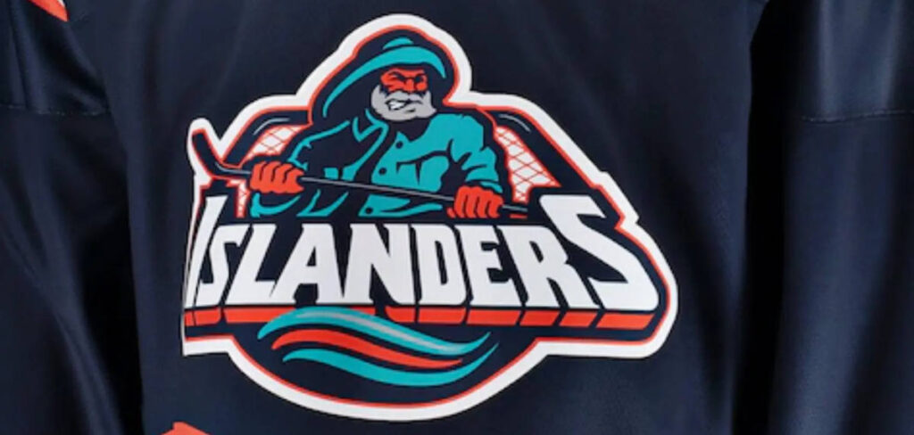
The New York Islanders’ “Fisherman” jersey, worn during 1995–97, got roasted for looking like a seafood label. But even the flops made the decade unforgettable. The NHL wasn’t afraid to take risks, and fans noticed.
Behind the scenes, CCM led the way in the early 1990s, with Starter and Nike entering later in the decade. Lighter air-knit polyester made jerseys more comfortable, while layered crests and stitched lettering gave them a premium feel.
For the first time, fans could feel the difference in quality between brands, and the craftsmanship across the league hit a new level.
By the late 1990s, design mattered as much as performance. Jerseys weren’t just uniforms anymore. They were collectibles, fashion statements, and a reflection of hockey’s growing swagger.
Standardization and Performance (2000–2006): One Manufacturer to Rule Them All
By the early 2000s, hockey cleaned up its look. The chaos of the 90s was fading, and the league wanted consistency.
The evolution of NHL jerseys shifted from loud experiments to sharp lines and smarter fabrics. This was the reset button the sport needed.
Starting with the 2000–01 season, the NHL signed an exclusive deal with The Hockey Company, the parent group behind CCM, Koho, and Jofa. It was the first time every team skated in sweaters made by the same manufacturer.
White jerseys carried the CCM logo, dark and alternate sets repped Koho, and Jofa focused on gear and the stripes worn by referees. It wasn’t about one brand taking over. It was about setting a standard.
The materials evolved, too. Polyester knits became lighter, tougher, and far better at pulling moisture away during long shifts. Jerseys hugged the body a little tighter, cutting drag and keeping players cool under the lights.
Every uniform started to look like it belonged in the same league again, no matter the logo on the front.
Creatively, teams went back to their roots. The Islanders, Oilers, and Capitals ditched the flashy 90s designs and brought back their classic colors. Fans wanted tradition. The league delivered.
In 2003–04, the color rule flipped again, putting dark jerseys back on home ice where they looked their best. It felt right seeing your team’s true colors in your own building. Even the small details got attention.
The fight strap rule was enforced league-wide, and nameplate and number sizes were standardized so players popped clearly on TV.
By 2004, Reebok had stepped in and acquired The Hockey Company, quietly setting the stage for what came next. The jerseys stayed branded as CCM and Koho through 2006, but the writing was on the wall.
By the time this chapter closed, NHL sweaters were sleek, durable, and consistent across the board. The wild 90s were over.
Hockey was ready for a new kind of uniform, and Reebok was waiting to change the game.

The Reebok Edge Era (2007–2016): The Performance Revolution
When the Reebok Edge system hit the ice in 2007, it changed everything about how NHL players suited up. After years of testing, Reebok rolled out a jersey built for speed, lighter weight, and modern performance.
It wasn’t about looks anymore. It was about how the game felt.
The baggy sweaters of the 90s were gone. In came a tighter cut made from advanced fabrics with mesh zones that helped players stay cool under pressure.
Reebok claimed the new design held far less water and stayed lighter from puck drop to the final horn. Players could tell the difference immediately.
Every team joined the rollout for the 2007–08 season, giving the entire league a fresh start. Some clubs took the opportunity to rebrand.
The San Jose Sharks, Ottawa Senators, and Tampa Bay Lightning embraced modern designs, while classic teams like Montreal and Detroit kept their traditional looks. It felt like hockey’s past and future were sharing the same ice.
Not everything worked perfectly out of the gate. The first generation, known as Edge 1.0, caused problems for players. The fabric trapped sweat, and moisture pooled in gloves and skates. Most teams switched to Edge 2.0 halfway through that first season.
The update featured a softer, air-knit material that fixed the comfort issues while keeping the lighter feel. Some players, out of preference or superstition, stuck with Edge 1.0 for years.
Smaller details evolved, too. The NHL shield moved to the collar for a cleaner look, though players initially disliked the stiff plastic patch until it was replaced with a softer felt version in 2011.
The fight strap, already common, became standard on every jersey. Collars also got a redesign with lace-up and V-neck options to match each team’s style.
Fans noticed the difference between retail and team-issued jerseys. Authentic Edge versions featured full fight straps and reinforced stitching, while retail models sometimes varied in construction.
Later came the “Indo-Edge” line, made in Indonesia. These looked similar to Edge 2.0 but used cheaper materials and never gained much respect among collectors.
As the years went on, fans started to appreciate what Edge brought to the game. Jerseys looked sharper, fit better, and felt more athletic without losing their roots. Outdoor events like the Winter Classic reignited interest in throwback designs, pairing vintage style with Reebok’s modern tech.
By the mid-2010s, the Reebok Edge had become the standard across the league. It struck the perfect balance between old-school grit and new-school performance, setting the tone for the Adidas era that was waiting right around the corner.
The Adidas ADIZERO Era (2017–2024): Lighter, Stronger, and Sustainable
When Adidas took over in 2017, fans were curious whether the brand could push hockey gear forward the same way it had with soccer. It didn’t take long to find out. The new ADIZERO Authentic jerseys felt like the future.
They were lighter, tighter, and designed to move like real athletic wear instead of stitched fabric.
Adidas borrowed its Clima performance technology from soccer kits and applied it to hockey, creating a uniform that actually breathed.
The fabric cut down water absorption, keeping players dry well into the third period. Crests were lighter, shoulders were textured for airflow, and the entire design was built for speed without sacrificing tradition.
Players could feel the difference, and fans could see it.
Visually, the league looked sharper. The NHL shield stayed at the collar, now redesigned with a metallic Chrome Flex finish that shimmered under the arena lights.
Adidas paused third jerseys for a season to focus on consistency, then came roaring back in 2018 with new alternates and bold redesigns. The Vegas Golden Knights debuted their metallic gray look, the Predators doubled down on gold, and the Oilers darkened their blue-and-orange palette.
Legacy franchises stayed true to their roots, keeping the mix of modern edge and classic identity alive.
Then came the moment that defined the era. In 2020, Adidas launched the Reverse Retro series, giving every team a throwback remix of past designs.
The Avalanche revived the Nordiques, the Coyotes brought back their desert dog, and the Bruins dusted off their old Pooh Bear look. Fans went wild. Jerseys sold out within hours, and nostalgia suddenly had a new level of swagger.
The success led to Reverse Retro 2.0 in 2022, which sparked another wave of collector frenzy.
The focus shifted to sustainability in 2021 when Adidas rolled out Primegreen jerseys, made with 50 percent recycled materials. They carried the same look and feel as previous versions but reduced the environmental footprint, proving performance and responsibility could go hand in hand.
By 2022, the league introduced sponsor patches for the first time, placed on the upper right or left chest. Traditionalists weren’t thrilled, but the placement was subtle enough that team crests still dominated the design.
By the end of the ADIZERO era, the NHL had found its cleanest, most professional look yet. The jerseys were lighter, more technical, and built for speed. When Adidas announced it would step away in 2024, fans knew whoever came next would have big skates to fill.

The Fanatics Era (2024–Present): The Next Generation of Hockey Uniforms
When the NHL named Fanatics as its new on-ice supplier, fans were skeptical. The brand was known for replica gear, not pro uniforms. But once the first jerseys hit the ice, most fans realized things hadn’t fallen apart.
The look was consistent, the quality solid, and the upgrades subtle but smart.
The Fanatics Authentic Pro jersey isn’t an upgraded Breakaway. It’s a separate, pro-level uniform made in Canada by SP Apparel, the same company that produced the Adidas ADIZERO line.
Built for NHL use, it features improved moisture control, reinforced seams, and flexible fabrics tough enough for a full season.
For the first time in years, fans can buy the same Authentic Pro jersey players wear. These Canadian-made versions headline the lineup alongside the Premium, Breakaway, and Practice models, giving fans more authentic choices than ever.
The on-ice design brings a few notable updates. A new hologram-style NHL shield replaces the old Chrome Flex patch, the sleeves are stronger, and the shoulders use textured fabrics for better movement and ventilation.
Most teams kept their existing looks, which helped the rollout feel stable. Players said the fit and weight were nearly identical to the ADIZERO uniforms, showing Fanatics prioritized consistency over change.
Critics expecting missteps didn’t find much. The transition was smooth, feedback was positive, and the gear met expectations.
The Fanatics Authentic Pro line proved that performance and tradition can coexist, keeping the NHL’s on-ice look sharp and reliable.
A century after the first wool sweaters, the hockey jersey still stands for pride, history, and the grind it takes to earn that crest.
The Evolution Continues: A Century of Style and Innovation
From wool pullovers to engineered fabrics, NHL jerseys have always reflected the game’s heartbeat. Each era brought new ideas that shaped how hockey looks and feels.
What began as a way to stay warm on outdoor rinks has become one of the most iconic uniforms in sports.
The early years were about survival. Thick wool sweaters trapped heat but soaked up water fast. As hockey moved indoors, the 1950s and 60s introduced lighter fabrics and sharper colors that stood out on TV. By the 1970s and 80s, creativity took over.
Nameplates, fight straps, and bolder designs gave every team its own personality.
The 1990s pushed things even further. Teams experimented with wild logos and third jerseys, turning hockey fashion into a talking point. The 2000s restored balance.
The Hockey Company (through CCM and Koho) standardized quality before Reebok’s Edge system made jerseys feel like true athletic gear.
When Adidas arrived in 2017, the focus turned to lightweight precision. The ADIZERO line improved comfort and breathability, and Primegreen, introduced in 2021, brought sustainability to the mix.
Adidas honored the past while modernizing the look, giving fans iconic programs like Reverse Retro along the way.
Now Fanatics carries the torch. Their first steps have been steady, using their massive reach to keep production consistent and open the door to faster alternates and future innovations.
Through it all, NHL jerseys have been more than equipment. They’re symbols of pride, history, and identity. From the wool days of Montreal to the metallic flash of Vegas, every stitch tells part of hockey’s story.
Legacy That Lives On
A century in, the jersey has become more than a uniform, it’s hockey’s canvas. Every stitch carries echoes of frozen ponds, championship nights, and the fans who’ve worn those same colors through decades of change.
The materials will keep evolving, the technology will keep improving, but that feeling when a player pulls on their team’s crest before the puck drops?
That’s timeless. And that’s why, no matter who makes them or what they’re made from, NHL jerseys will always tell the story of the game better than words ever could.


